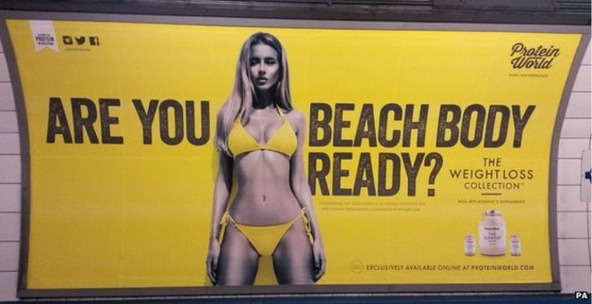
Are you beach body ready was a advert campaign for protein world which garnered controversy when it was displayed as a poster on the tube. The poster shows a scantily dressed woman in the centre of the poster in between the text 'Are you beach body ready?'.
The poster is objectifying the model as a beauty standard to be upheld through the use of their product. The woman also seems to be fully on display like a product and that the poster could be seen as implying that her worth is entirely based on her body and looks.
The use of yellow as a base colour stands out well and the matching colour of the bikini could be showing the implication that the woman belongs to the company through matching to them rather than being an individual. Yellow as a base colour denotes energy and positivity which matches well with the product of protein powder for exercise. The fact that the woman is monochrome rather than having her skin be a normal colour both contrasts the yellow of the poster better and makes it easier to dehumanise her and she her as an object rather than a person. They grey acts as the posters positive space, while the yellow is the negative
The text goes across the woman to frame her and draw attention to her as the positive space. The beginning 'are you' is separated and draws attention from the audience referencing them directly. The next part of the text 'beach body ready?' finishes the question and having the woman directly before establishes her as what beach body ready actually means.
This poster received a lot of backlash for how the model was objectified and put on a pedestal above others. People argued that this was an unrealistic body standard for women, this was exacerbated by the fact that the audience that saw it the most; commuters, likely don't in have a lot of time in general and didn't like the implication that they were being lazy for not being in as good of a shape as the woman in the poster.
Men's Health magazine

The magazine Men's Health is a lifestyle magazine about health and bodybuilding for men. A common them is that they have an image of a body builder or otherwise famous man on the cover shirtless to show off their muscles. This gives the message that reading the magazine can help a man body build and look like that.
This image is surrounded by the titles of articles found inside about quite similar things every time. The articles are usually about bodybuilding, healthy lifestyle and sex. While this is a magazine about these topics it also reduces men to being the sum of these things. A man's worth is determined by how strong he is and looks and by how much sex he has. This perpetuates the stereotype that men are sex obsessed.
The black text contrasts the white background to draw attention to the titles of the articles. However the addition of the red text contrasts the other text to draw attention to the title, list of tips and the sex.
The man being centered shows him off as an ideal to strive towards for the intended audience. However his view is off camera to show that he isn't being framed as an object of desire through a sexual look.
No comments:
Post a Comment