Tuesday, December 11, 2018

Video game cover


Image result for doom 2016Image result for doom 2016


Doom 2016 Alternate cover art
This is the alternate art for the 2016 release of Doom.
This art imitates the cover of the original 1993 release of the game featuring the main character fighting off hellish monsters whilst standing elevated on a pile of bones with the tile above them. The dark reds of the back ground and demonic enemies serves to emphasise the main character and focal point of the front cover because his green armour contrasts the red and oranges. The sketchy painted aesthetic imitates the 1993 cover style and is in the  same style as other cover and titles from the 90's.
Even certain aspects of the original cover have been reworked for the new; the demon staring at person looking at the cover, the soldier running towards the main character has turned into a giant demonic hand reaching out at him in the background. This explicitly shows the theme of it being an FPS/Horror with explicit graphic violence and intense gameplay.
This can be compared to the original art of the 2016 release which in comparison doesn't reflex the themes of the game and looks more like a generic shooter which could be the same as any other FPS game. The horror/hell aspect of the game being completely absent other than the dark colour scheme with metallic yellows and greens which could reflect illness and is present throughout the games map.
The alternate art also reflects the nature of the game as a remake of the original 1993 release as showing the art as a remake and improvement as well. The original doesn't reflect this as well and could be mistaken as an original.

Friday, November 23, 2018

Adidas Advertising - Social class

Adidas Advertising - Social class

In this campaign, we are advertising Adidas. The adverts revolve around the issues of social class, showing the juxtaposition between the rich athletes who wear Adidas products and the working class who wear it as street wear. In the past, Adidas have made advertising around equality to do with race. Now we are doing equality within social classes. We want to show that people of all classes can do great things and find success in their chosen area. Our chosen demographic is younger people, as we feel it is important for them to know that they are capable of achieving, no matter social class or background.
The white background and brighter lighting which is a staple of sports brand advertising, especially adidas.
We have also tried to imitate their style with the bright colours and shapes around the image and a relatively minimalist design.

Tuesday, November 6, 2018

Advertisement

McDonalds Tex Mex stack advert

The opening shot of a street with a bus stop and a block of flats behind is purposefully made to look as plain and commonplace in the uk as possible. The two men are introduced into the scene in a wide shot to make it clear that they're having a conversation at the beginning seconds. They are both dressed plainly but in clothes that correspond with the transformation that is being set up for.
As the friend walks into the scene it cuts to a closer mid shot which corresponds more with two friends having a conversation. It has the effect of making the conversation feel closer and more intimate than the wide shot this was purposefully chosen as it corresponds to McDonalds brand as a friendly reliable place. This cuts to a second mid shot of the friend in blue introducing the burger being advertised. This cuts back to the friend in brown for a second who shows interest before cutting again to show that he's had his hairstyle changed. This repeats itself again to reveal the friend dressed entirely as cowboy, finishing his description. The next cut changes the shot to a mid-wide shot revealing his entire outfit and moving the camera angle so that he is no longer talking directly at the audience but rather at the friend to draw attention back to him. In the same vein as the last two examples the camera is cut back to him to show his own cowboy outfit, representative of their interest in the burger. The final shot of the two returns to the wide shot from before showing them riding away on a ?. This juxtaposes the street and draws attention to them as a point of humour.
This changes to showing off the four burgers from the 'Great tastes of america' range zooming into the slowly. The last cut being the specific Tex Mex burger rotating.

McDonalds Poster Tall blonde gorgeous

This poster shows a completely white background with a picture of fries on the right and the phrase 'tall blonde gorgeous' in red to contrast the background and stand out. The phrase is obviously supposed to be a decryption of their food and simultaneously a subversion of how the phrase would usually be used; to describe a person. In this way it is implied that people can and will have an intense emotional connection or even sexual attraction to the fries. Obviously being a dramatic exaggeration of how good, or even just nice looking their fries are. The way the fries are slightly out of shot makes the audiences attention first go to the text which sets up their expectations, which are then subverted when they see the actual product.

Monday, October 8, 2018

Use of media - Panic! at the disco

Audience

Expectation

As with all media forms, there is an expectation that the content be of a somewhat decent quality, and with a budget of more than £2. There is also the general expectation that the work consistently improve, with the newest work being better than the last work. Specifically for Panic! at the Disco, there is the expectation that Brendon Urie show up somewhere in the music video, either being sexualised or demonised.

Profile

Brendon Urie presents himself as classy, by constantly wearing suits in recent videos. When he is not in suits, he is usually half naked. This goes along with his star persona of being very sexual and open about it. He is also often presented as demonic. 0

Feedback

Identification

Social media

Panic! at the Disco have a strong online presence. Both the band's main twitter and Brendon Urie's personal twitter are fairly active, tweeting every couple of days. Many of the tweets on the band's account are tagging other accounts, which allows them to garner wider attention from the audiences of these other accounts.

Soundtrack

For the movie "Suicide Squad", various musicians were hired to do record different songs, some brand new songs and some covers. Panic! at the Disco played a cover of "Bohemian Rhapsody"by Queen. This song was used in advertising trailers and in the movie. DC, while its movies still fall flat is decent, has a large audience. This then let them reach the viewing audience of the movie, as well as fans of the band Queen.

Friday, September 28, 2018

How the gender's are portrayed in the media.

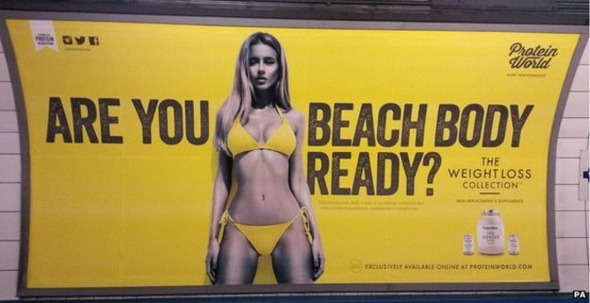
Are you beach body ready? Campaign - Protein WorldImage result for are you beach body ready


Are you beach body ready was a advert campaign for protein world which garnered controversy when it was displayed as a poster on the tube. The poster shows a scantily dressed woman in the centre of the poster in between the text 'Are you beach body ready?'.

The poster is objectifying the model as a beauty standard to be upheld through the use of their product. The woman also seems to be fully on display like a product and that the poster could be seen as implying that her worth is entirely based on her body and looks.

The use of yellow as a base colour stands out well and the matching colour of the bikini could be showing the implication that the woman belongs to the company through matching to them rather than being an individual. Yellow as a base colour denotes energy and positivity which matches well with the product of protein powder for exercise. The fact that the woman is monochrome rather than having her skin be a normal colour both contrasts the yellow of the poster better and makes it easier to dehumanise her and she her as an object rather than a person. They grey acts as the posters positive space, while the yellow is the negative

The text goes across the woman to frame her and draw attention to her as the positive space. The beginning 'are you' is separated and draws attention from the audience referencing them directly. The next part of the text 'beach body ready?' finishes the question and having the woman directly before establishes her as what beach body ready actually means.

This poster received a lot of backlash for how the model was objectified and put on a pedestal above others. People argued that this was an unrealistic body standard for women, this was exacerbated by the fact that the audience that saw it the most; commuters, likely don't in have a lot of time in general and didn't like the implication that they were being lazy for not being in as good of a shape as the woman in the poster.

Men's Health magazine


Image result for men's health
The magazine Men's Health is a lifestyle magazine about health and bodybuilding for men. A common them is that they have an image of a body builder or otherwise famous man on the cover shirtless to show off their muscles. This gives the message that reading the magazine can help a man body build and look like that.

This image is surrounded by the titles of articles found inside about quite similar things every time. The articles are usually about bodybuilding, healthy lifestyle and sex. While this is a magazine about these topics it also reduces men to being the sum of these things. A man's worth is determined by how strong he is and looks and by how much sex he has. This perpetuates the stereotype that men are sex obsessed.

The black text contrasts the white background to draw attention to the titles of the articles. However the addition of the red text contrasts the other text to draw attention to the title, list of tips and the sex.

The man being centered shows him off as an ideal to strive towards for the intended audience. However his view is off camera to show that he isn't being framed as an object of desire through a sexual look.

Thursday, September 27, 2018

Definition and example of cross platform advertisement

Cross-platform advertisement is a form of advertising that spans multiple media types such as TV, online ads and posters. Most well funded advertisement campaigns are cross-platform. This is because cross platforming can engage a product with a far larger audience than a single media type could.

One of the best cross-platform advertisement campaigns was the ad campaign for the Netflix series Stranger Things. It featured extremely innovative collaboration adverts in preparation for the airing of its second season after the success of the first series.

The marketing team collaborated with Clothing brands to create lines of clothing featuring the characters in the run up to the second season.They collaborated with Reebok to create limited edition shoes in the style of one of the shows main characters. This acted as a reference to the show for those returning and would garner interest for people who haven't seen the show. Netflix also paid the retailer Topshop to refurbish their Oxford street store into a Stranger things theme. This went with the line of clothing that they also released in the run up to the season's release.


The music streaming service Spotify created a test for users to see which character they were most like and let users listen to a playlist of music based on the characters. This works well because the age demographic of Spotify users and the target audience of the show are very similar with the majority of users of Spotify being 18-24 and the majority of Netflix users being 18-29.

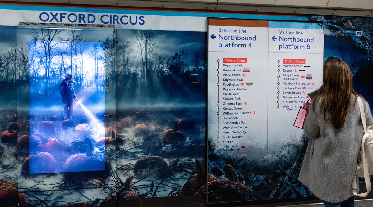
A mural to the show was created in oxford circus tube station through TFL which was larger than any other posters around the station. Rather than being just a poster the art extended onto the signs around the station to stand out to passerby's and make them more likely to take notice than with a traditional poster.

However the traditional posters that were created didn't advertise the show directly they advertised a Fictional company from the story of the show which looked like a normal energy provider's poster. The locations chosen for the posters were even among other posters for energy providers and similar companies. All of these posters featured a number which when called played a recording from one of the shows actors which played a message about the plot of the new season. This was targeted more at those who were already fans of the show but also may have played a practical joke on unsuspecting people to create interest in their show.
Image result for hawkins power posters

Tuesday, September 25, 2018

Key Terms Dictionary

Purpose - the reason for which something was created.

Style - a particular appearance typically determined by the principals in which it was designed.

Performance - how the form of entertainment is presented/the music video being focused on the artist.

Narrative - the music videos focus being on the story mostly.

Thematic - Having or relating to subjects or a particular subject.

Representation - How a certain group is portrayed by the media.

Gender - Male or Female

Ethnicity - cultural factors including nationality, regional culture, ancestry and language.

National Identity - sense of a nation as a cohesive whole represented by traditions culture and language.

Shots - a shot is the continues footage and movement of camera in between cuts or edits.

Angles - the position of the camera relative to the subject of the shot.

Movement- how the camera moves through the shot

Cut- a cut is an abrupt but trivial transition from one shot to another

Fade- a transition effect where the image slowly goes to black

Pace- the rhythm of the action in conjunction with the sequence.

Cut to beat- the cuts of a sequence being in time with beats in music

Expression and Gesture- visible body and face actions in a scene as a form of nonverbal communication.

Costume and Props- costume is what the subject is wearing in a shot which can match a theme or reflect something in the scene. A prop is an object used on the screen by an actor which is considered separate from the costume.

Iconography- the identification of symbols or themes that reoccur in an artist's films.

Lighting and Colour- the position of the lights, the light level and the set's colour.

Graphics- images which are generated by a computer.

Genre- a specific type of writing, film or music.

Star persona- The images and set of meanings that are recognisable to the audience in a star's work.

Motif-a re-occuring idea or image in the work of an artist.

Anchorage- when a piece of media uses another piece of media to reduce the amount of connotations in the first so it can be interpreted more easily.

Intertextuality- the process of creating references to any kind of media text via another kind.

How we consume media video